
Slicers in Power BI are being used to filter the reports. The greatest thing about slicers is that you can completely change their format. You can easily customize slicers based on the end users’ requirements.
Please read the article completely to understand how to use and apply it. You can also watch the video on YouTube channel for better understanding.
Slicers can be customised and we can change their format in Power BI which is very amazing. I’ve worked with different visualisation tools and each of them have a limited number of customization for slicers and filters. But, Power BI provide the highest variety among all them.
You can easily change how they look like. They can look like buttons, drop down, list, numeric range slider, timeline, and hierarchy slicers. You can set different options for different needs. Look what your stakeholders need!
Stay with me to learn quickly how and when to use these options. Don’t loose this video up to end to learn everything about slicer and a final cool tip.
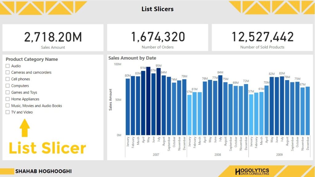
List Slicer
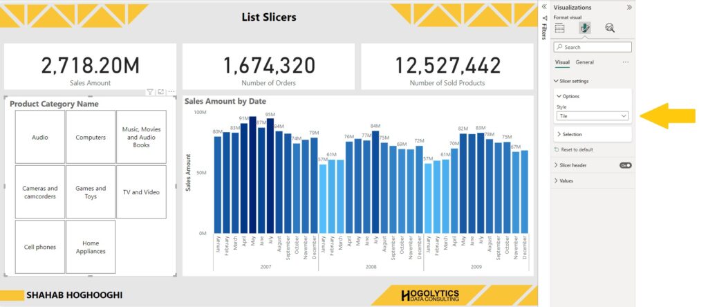
The first slicer type is list. We usually use list slicers to filter our visuals by a category.
First thing you should do is choose the slicer visual from the visualisations list. Then, choose a category you want to filter your report. For example, ProductCategoryName. As you can see the default slicer type is set as a list for the text value categories. It means when you drag a text value field into the slicer visual, Power BI automatically creates a list slicer for you.
Let’s have a look at formatting options.
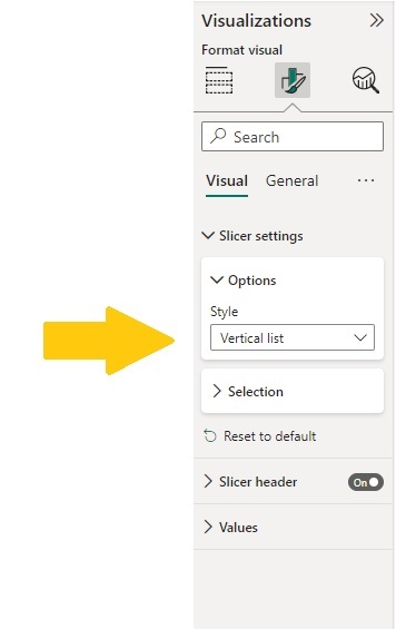
Within the slicer settings you can see the Style. For list slicers, you should choose Vertical List option.
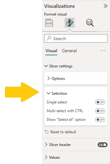
Then, you can see the selection. There are 3 different options available here.
When all the options are off, it means you have a list in which you can choose 1 or more options.
When you choose single select, the list options will be changed to toggle selection. It means you can only choose one of them at the moment.
When Multi-select with CTRL is on, it means that you can only choose 1 item at the same time, but if you want to select 2 or more options, then you have to press Control button on your keyboard and then add the other selections.
And, finally, the “Show Select all” option add an item to your list which helps you to select all the options just by one click.
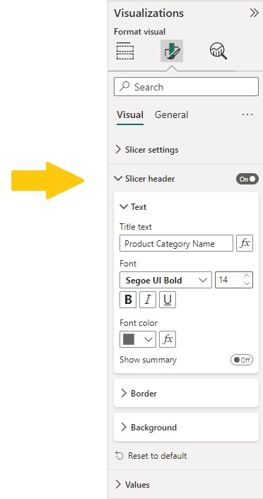
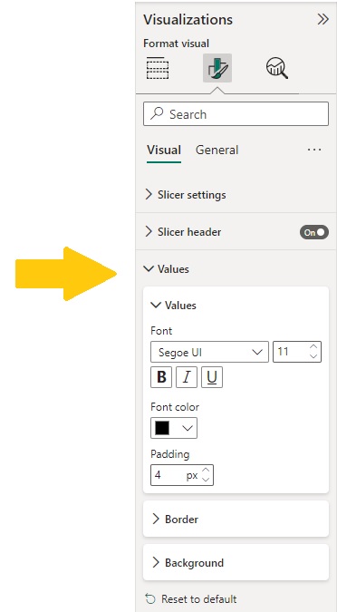
The Slicer header formatting option will allow you to turn on or off the header, change colour, font, font size, border, and background for the header.
And the Values option allows you to format the options in your list.
Button Slicers
The next slicer type is button slicer. If we select the slicer visual and drag a category field into it, automatically, a list slicer will appear for you. Then, you should go to format visual pane, and from the slicer settings and option menu, choose Tile. Now all the categories are available in tile format which is similar to buttons.
All the other settings are exactly similar to the list slicers. For example, you allow your users to choose only one option, multiple options, or multiple options by holding Control button on your keyboard and adding Select all option to the buttons.
The interesting thing about button slicers is that this slicer type is responsive. It means that if you need vertical buttons you can just increase the height of the slicer and decrease the width. And vice versa for the horizontal button slicers you need to increase the width and decrease the height.
DropDown Slicers
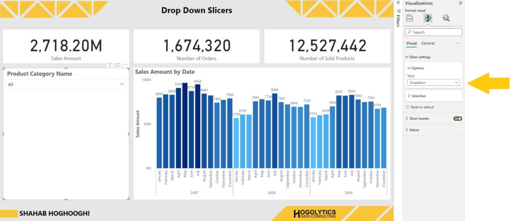
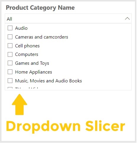
The next slicer type I wanna talk about is drop-down slicers.
Create a slicer visual and drag ProductCategoryName into it.
Now from the Slicers Settings, change the style option to the drop down. And, that’s it. Now you have a drop down slicer and all the other options which are available for List slicers are now available for drop down slicers.
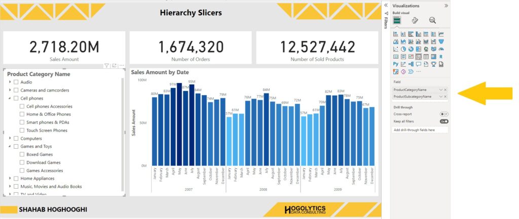
Hierarchy Slicers
The next slicer type is hierarchy type. Create a slicer visual and drag ProductCategoryName into it.
Now if drag the subcategory product name below the categories in the visualsiation field, you will be immediately notice some arrows will be created beside the list options.
This allows you to drill down to the subcategories and select each of them you like.
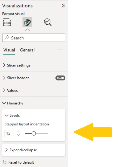
If you create a Hierarchy slicer, 2 other formatting options will be available for you.
You can increase or decrease the indentation. Just remain it as something that don’t make confusion for your users. I think something more than 15 is great.
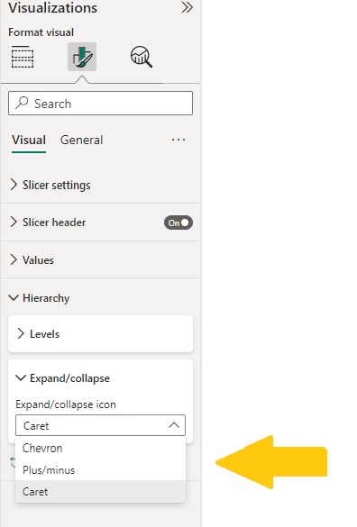
Also, you can choose the expand/collapse icon. It is automatically set on Chevron, but if you like you can change it to Plus/Minus button, or Caret. So interesting!
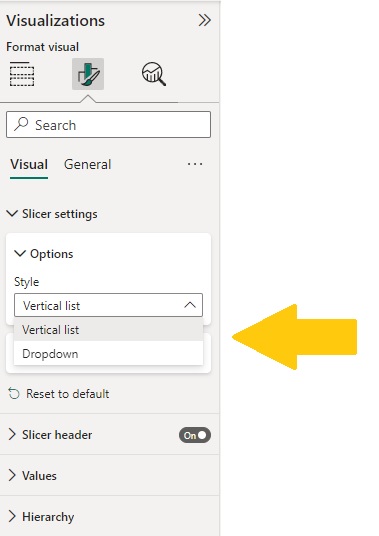
If you open the style option from the slicer setting menu, you will see only dropdown and list are available for you. So, if you need to create a Hierarchy slicer, you should choose either list or dropdown style.
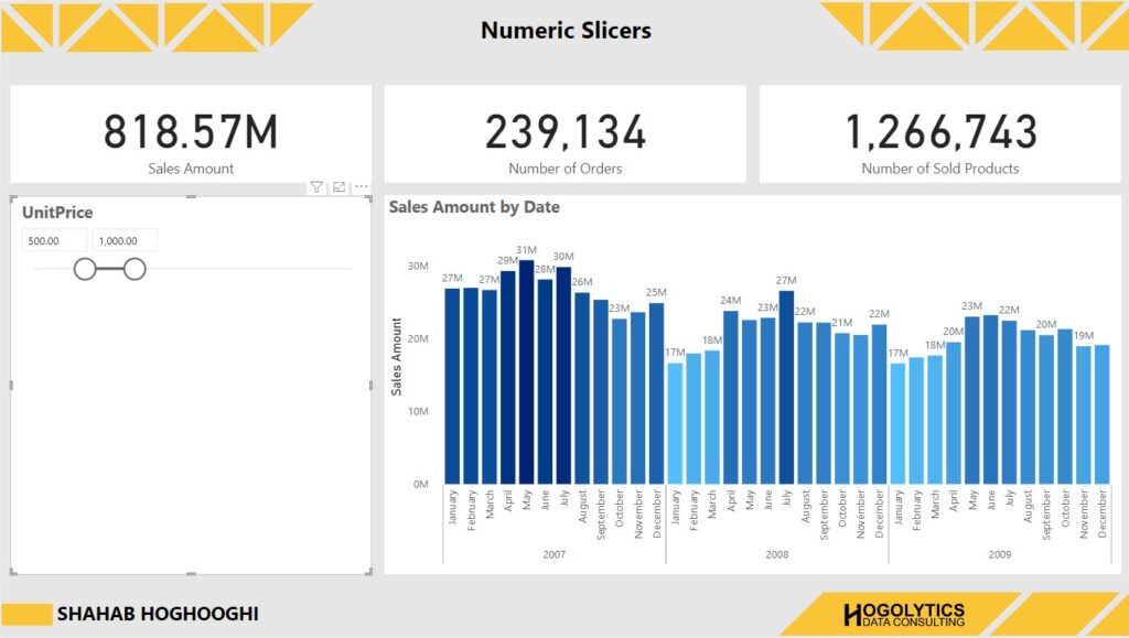
Numeric Slicers
The next slicer I wanna talk about is the numeric slicers. Let’s create a slicer and add a numeric field to it. Fore example, I add UnitPrice to the slicer.
Now you can see a slider slicer and you can change the slider to see the report for the product prices in the range you define. You can also insert the values manually in the range field. For example, define the range for minimum $500 unit price and the maximum $1000. Then, you can see the report filtered for the products in this price range.
Let’s have a look at different styles available for numeric slicers.
If I open the slicers settings, you can see the slicer style is set on between. It means that you can change the slicer between two values.
If you choose “Less than or equal to” then you can have a slider which you can only choose the maximum value. The same if you choose “Greater than or equal to” you can only choose the minimum value.
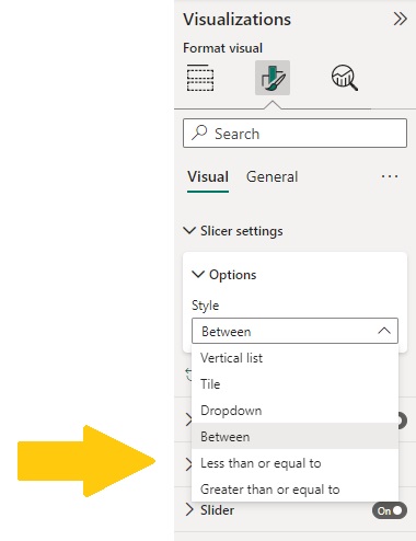
Also, the other slicer types, list, tile, and dropdown are also available for you to choose. But mostly if you have a range of values it’s better to use the sliding slicer.
Timeline Slicers
The last type of slicers is the Timeline Slicer which you may use a lot in your reports.
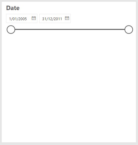
To create Timeline Slicer easily create a slicer visual and drag the date field from your dim date table into the visual field.
You can see the same as numeric slicer a slider created for you and you can move the slider to change the date range.
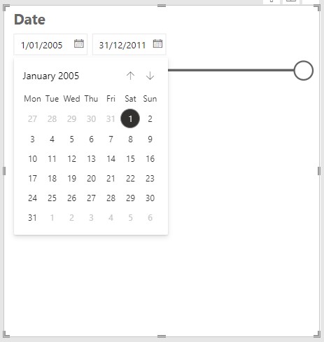
You can also manually enter the start and end date in the fields or if you click on the calendar icon, a calendar will open up for you and you can choose the start or end date for the slicer.
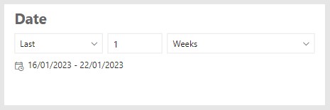
If we have a look at the style options we can see different types of Timeline slicers. Initially it is set on between, but you can change it to other types like, before, and after or even list, tile, or dropdown.
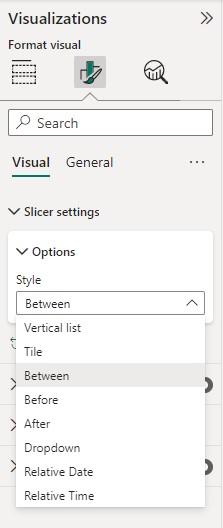
You can also see two other options. The first one is Relative Date which helps you to filter your report based on a specific amount of time. For example, Last 10 days, Last 5 weeks, Last 1 year, and even this week, month, or year.
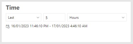
The other option is “Relative Time”. And this options is applicable when you’re using a datetime field for the slicer. It helps you to filter your report page based on the hours and minutes.
These are the all types of slicers available in Power BI which empower you to filter your visuals.
To understand this topic completely, and also learn an interesting tip on how to sync your slicers in different pages you can watch the YouTube Video on my channel. Please read other articles on this blog to learn Power BI like a Pro!
Hope you enjoyed this article and please put your comments below this post.