
In the previous article we’ve learnt what bookmarks are and what different options they have. Bookmarks helps you to add a variety of interesting features to your report which makes your report professional. Usually bookmarks are being used at the same time with BUTTONS. In this article I will talk about buttons, how to create them, how to format them and what are the different actions we have.
Don’t forget to put your comments below this post, watch the YouTube video for better learning and subscribe to the channel!
Interested?! Let’s go!
Buttons are one of the most useful features in Power BI. You can use them to create reports which are pretty similar to apps. You can also create an environment where your end users can hover, click, and interact with the Power BI content. Buttons help to improve user experience, so, learn how to use them today!
How to Create Buttons in Power BI
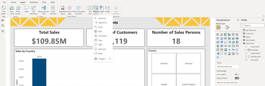
In your Power BI desktop, go to the “Insert” ribbon, and then select “Buttons”. When you click Buttons a drop-down menu will appear for you, in which you can select what type of button you like to insert in your report. In most cases, I recommend to choose Blank Button option, and then customise it based on your requirements. However, sometimes you need to choose other button types like Help, Q&A, and so on.
Buttons Formatting Options
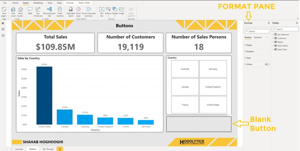
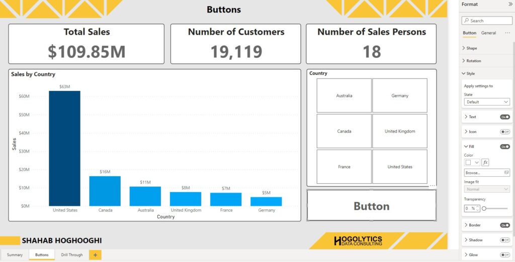
Once you created a button (a blank button in this example) you can apply formatting. Apart from the General formatting options which are available for most visuals, we have 4 different formatting options for buttons: Shape, Rotation, Style, and Action. Here, I’ll describe all them one by one.
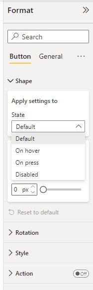
Shape
Under the Shape format section, you can see two parts. First, you can see the State of the button. You can apply all the settings for buttons like shape of button and their style for 4 different states, Default, On Hover, On Press, and Disabled.
Default state is being used when no action is applied on the button and the user sees the button in a normal condition. In other words, it shows the initial state of a button, how it looks like at first glance.
When On Hover option is selected, then you can change the settings for when the users hover their mouse on the button. For example, the font, size, or colour of the button can be changed when someone hovers mouse on the button.
Third state is On Press. It helps to define the state for the moment a user presses the button. The settings can be specific for this specific action.
And finally, Disabled state which helps you to set your buttons when they cannot be selected.
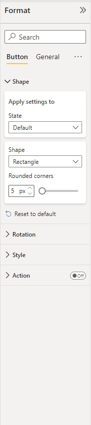
You can modify the shape of your button, based on these four states.
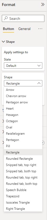
If you press on the Shape drop-down menu, a list of different shapes will appear for you. Then you can decide which shape to use for your button, such as Arrow, Rectangle, or Pentagon.
Then below it, you have the Rounded corners option which helps you to round the edges by increasing the number of px or using the sliding bar.
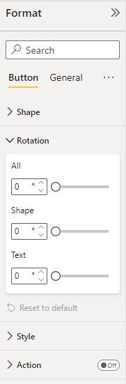
Rotation
In this part you have the ability to rotate your button in different angles. You can insert the angle number or move the sliding bar beside it. There are 3 different rotation option available for you to rotate all the button elements, only rotate the shape, or only rotate the text.
Style
The same as Shape State section, here we have different states which helps us to change the styles for each state.
There are different options available to modify in Styles section. To apply each of them on your button you should you should first turn the related toggle on.
Text: You can change the text value, its size, colour, font, alignment, and padding showed on the button.
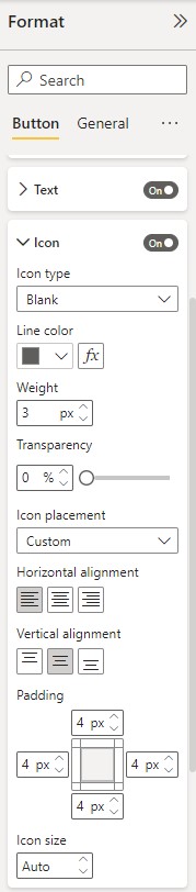
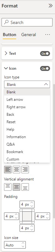
Icon: You can choose an Icon Type and your button will be changed to it, like an arrow. You can also format the colour, line weight, transparency, and etc.
Fill: This helps you to change the background colour of your button and set its transparency. You can also have the option to choose an image as the button background.
Border: Using Border formatting you can apply a border with specified thickness and transparency.

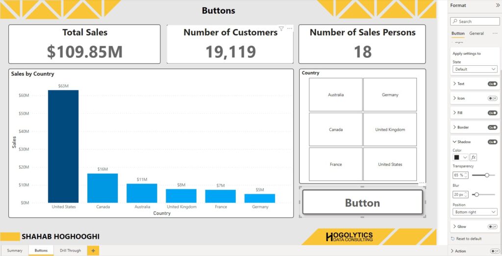
Shadow: You can apply a shadow around your button for better visibility.
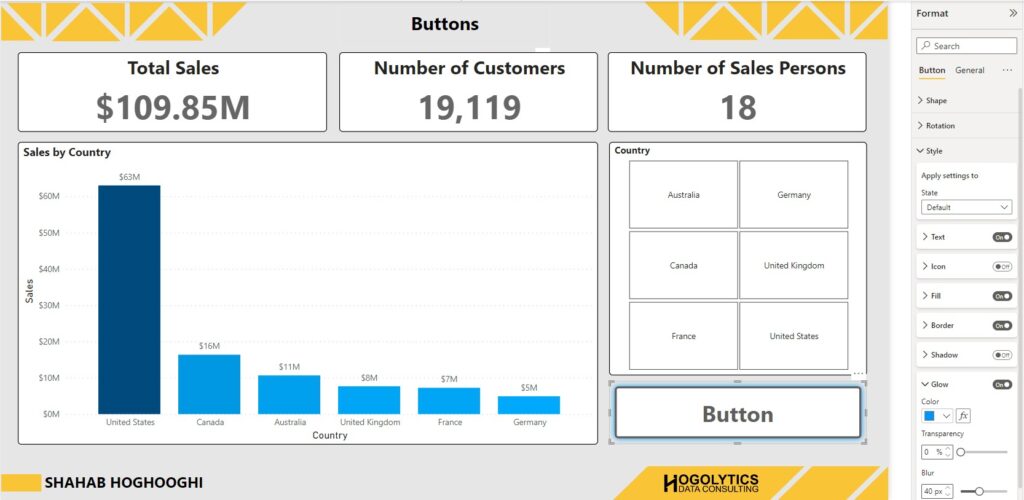
Glow: You can use a glow with the specified colour around your button.
Action:
As you remember in the bookmark article I talked about that bookmarks are usually being used with buttons simultaneously. This is the section which adds these kinds of functionality to the buttons.
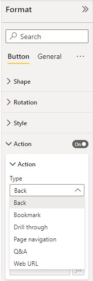
This section is very important and all the functionality of a button is related to setting Action. So, I’ll describe each of these options with an example.
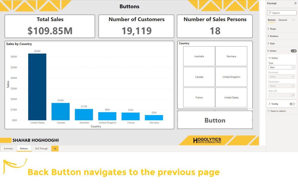
Action Type: Back
When you choose this type of button, the button navigates you to the previous report page you were in. For example, If we have a report like the below one, and in Buttons page you created a button with Back Type, then if you go the Summary page, and then open the Buttons page and click on the button, the button navigates you to the previous page you opened. In this case, it navigates you to the Summary page.
There is another use case for Back Button Type and it is when you use drill through option on your report. When you create a drill through function on your visuals, on the target page a Back button will be created automatically. However, if you removed it by any reason, you can create it easily from the Action section and choosing Back button type.
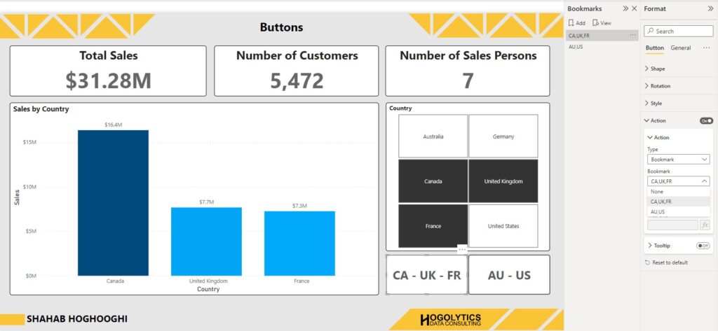
Action Type: Bookmark
The second Button Type is Bookmark. Probably this type is the most used one you will deal with in future. As you remember in the Bookmarks article I described how you can create a bookmark. But the issue is that the bookmark pane is available within the development area and your end users cannot see it. So, if it’s the case, how they can apply a bookmark?
Correct! They can create a button, and then, choose the Bookmark from Action Type menu. Then in the next field you should define which bookmark is related to your button. It means that by pressing the button, which bookmark should be activated. Cool!
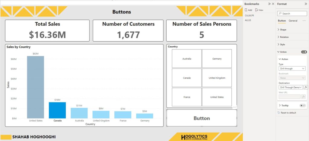
Action Type: Drill Through
Instead of right click on a visual and select the drill through option, you can easily select the the category you like to drill through, and then click on the button which the Drill Through type defined for it. Then you will be navigated to the page your report should be drilled through. You should also define which page your report must be drilled through by choosing the option in the Destination filed.
The only thing you should notice is that if you don’t choose a category for drill through, the button will be showed as inactive. So, you should first select a category, in the example below one of the countries in the column graph, and then when the button activated you can drill through to the next page.
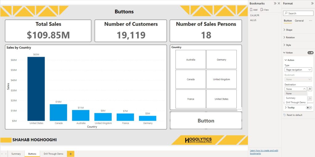
Action Type: Page Navigation
By choosing Page Navigation type you can create a button which helps your end users to navigate a specific page. The only thing you should set after choosing Page Navigation type is defining the Destination page.
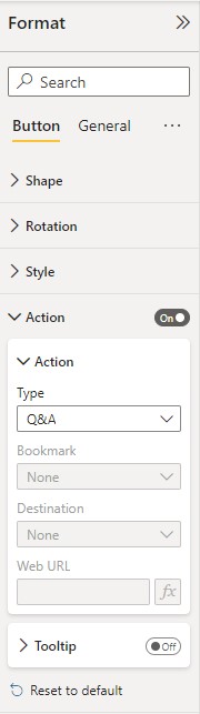
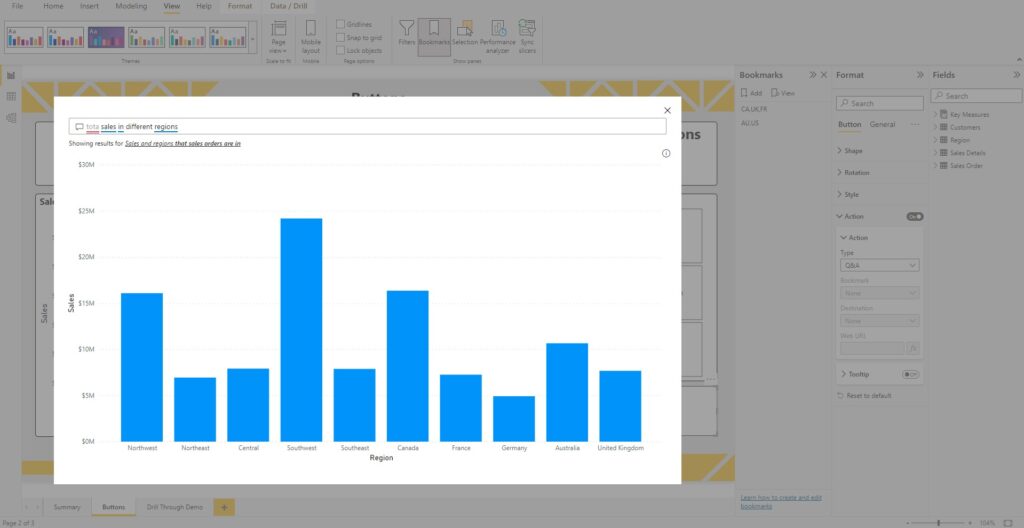
Action Type: Q&A
This button type helps end user to get benefits from Power BI Q&A feature.
When you press the Q&A type button a window will be opened and you can find different options. Very briefly I describe the Q&A here. It consists of four core elements that you can use in your reports:
- The question box. This is where users type in their question and are shown suggestions to help them complete their question.
- A pre-populated list of suggested questions.
- Icon to convert the Q&A visual into a standard visual.
- Icon to open Q&A tooling, which allows designers to configure the underlying natural language engine.
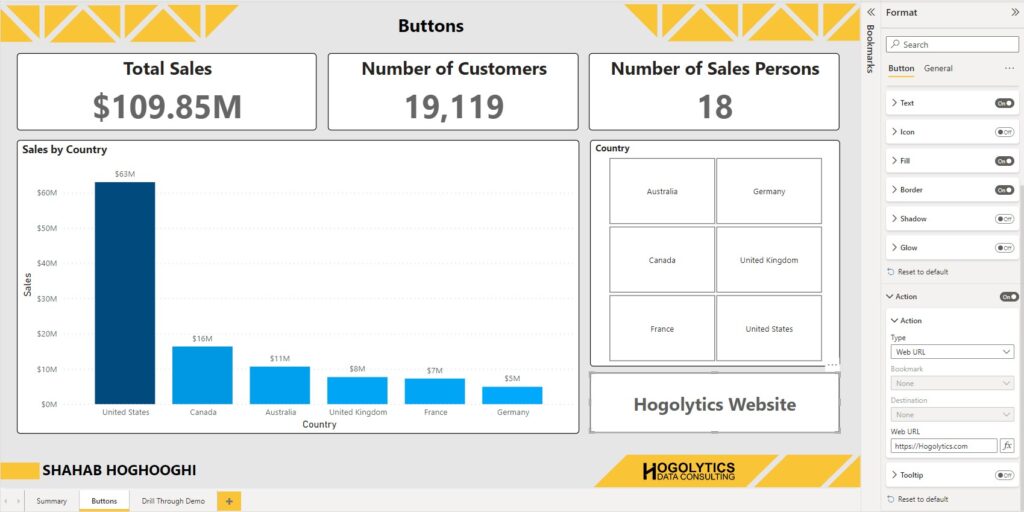
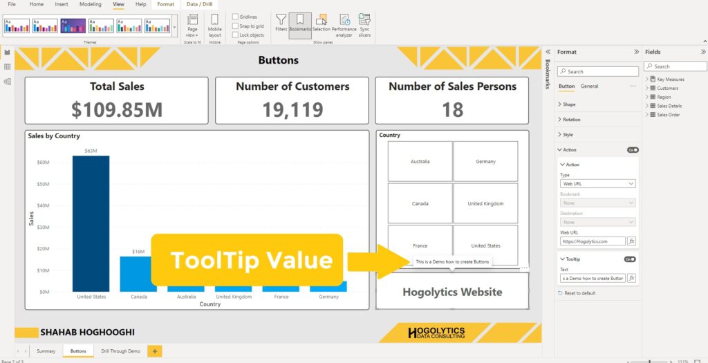
Action Type: Web URL
As the name of this type is clear, you can copy a specific Web URL in the specific section, and when the users press the button the particular website will open.
Tooltip
And finally, you can add a tooltip on your button. This feature is available within the Action section. Tooltips can contain a text value or a field value. When you hover your mouse on the button, the tooltip will appear.
In this article you have learnt what buttons are in Power Bi and how you can use them. But it’s not all you can do with buttons. There are lots of amazing tips and tricks that you can apply to your reports using buttons. So, don’t miss upcoming posts and videos on Hogolytics YouTube channel. Please comment all your questions or anything you believe can improve this blog.
Have a good day!
Hi there everybody, here every one is sharing these experience, thus it’s leasant to read this blog, and I used too
pay a quick visit this web site every day.
I don’t even know how I ended up here, but I thought this
post was great. I don’t know who you are but definitely you’re going to a famous blogger if you aren’t already 😉 Cheers!
Thanks for your comment, Happy you liked it.